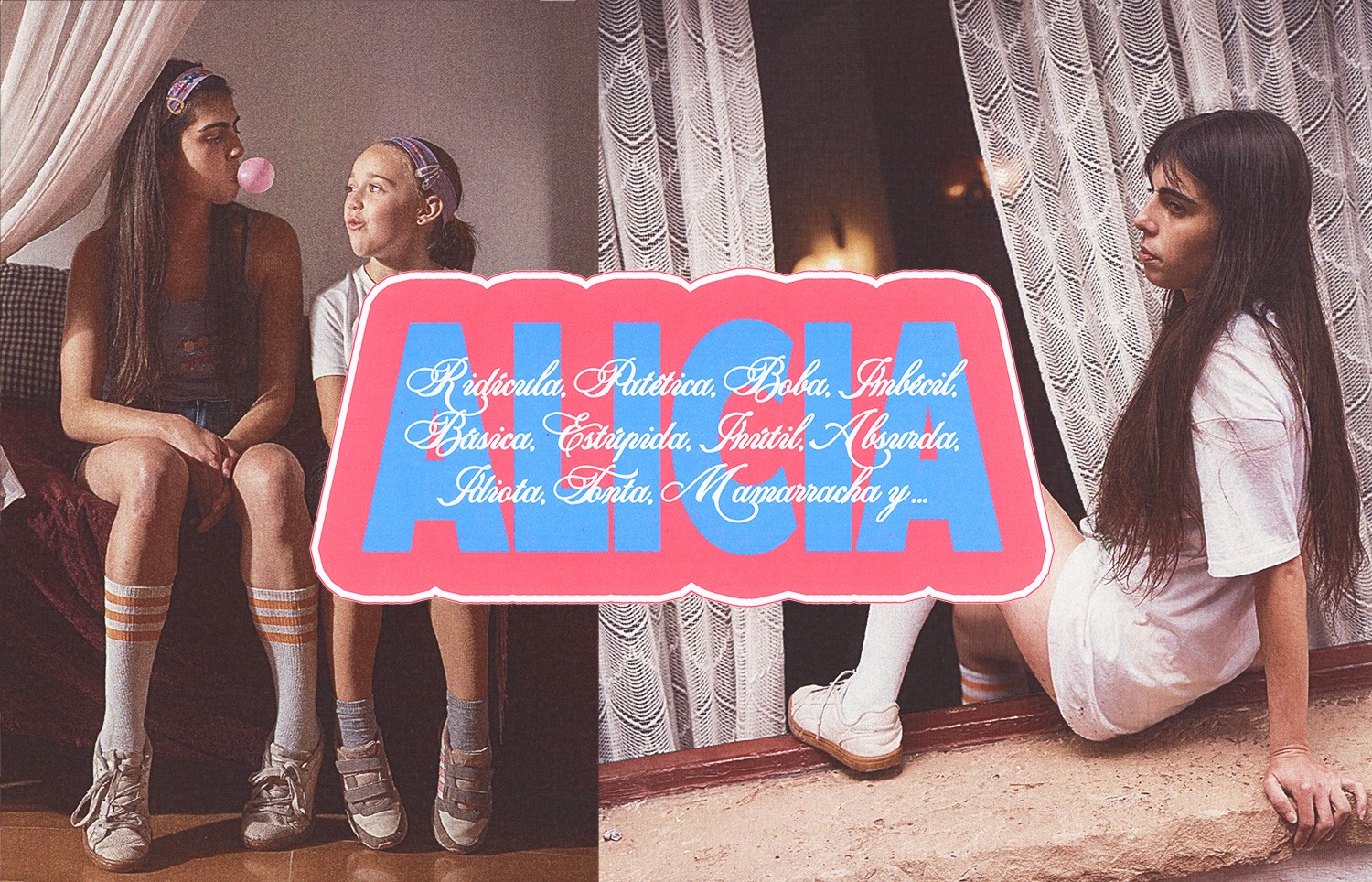
Alicia Gilipollas
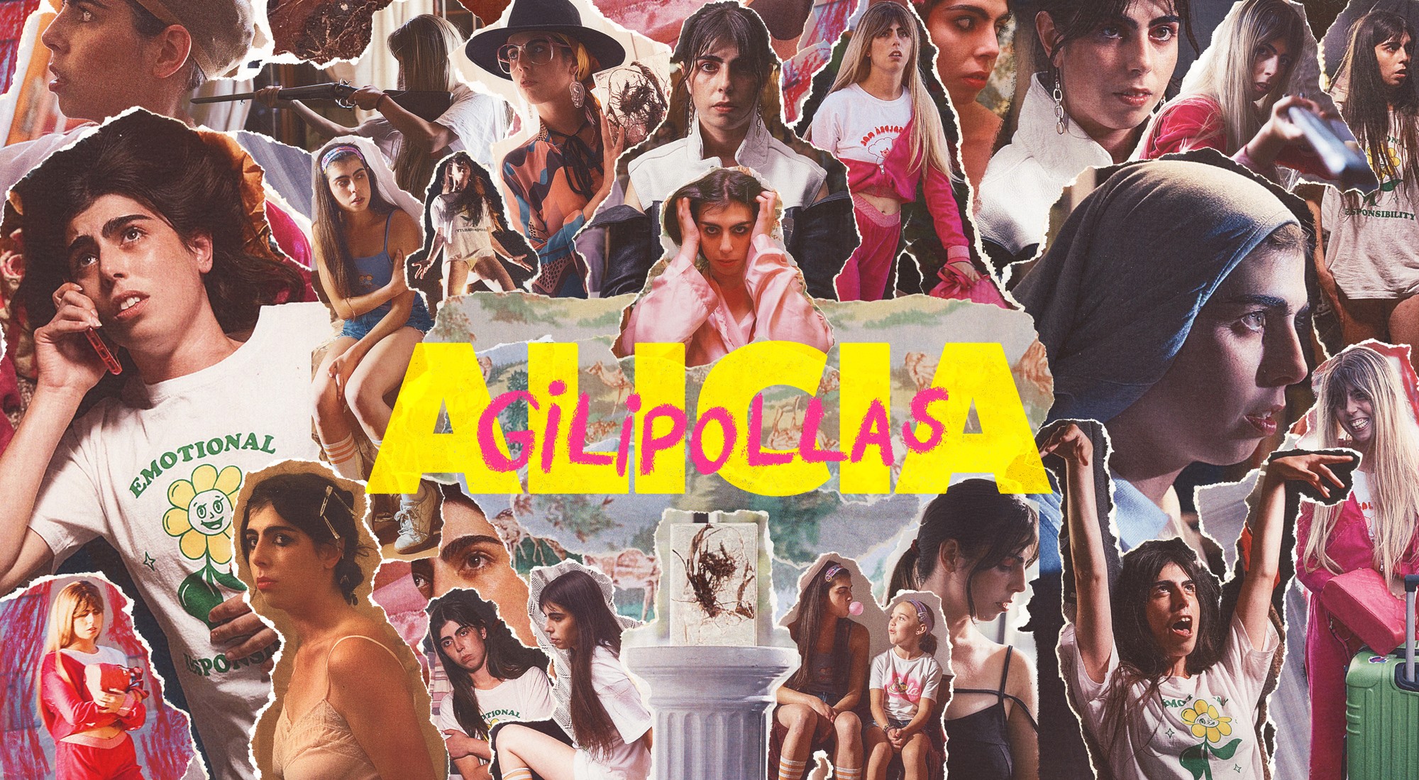
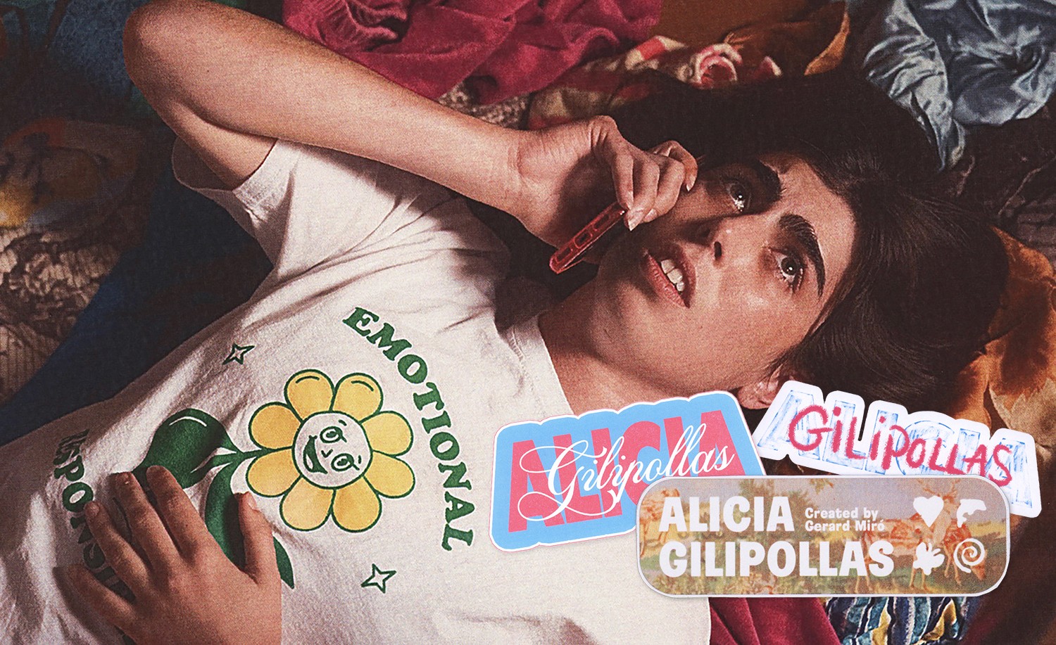
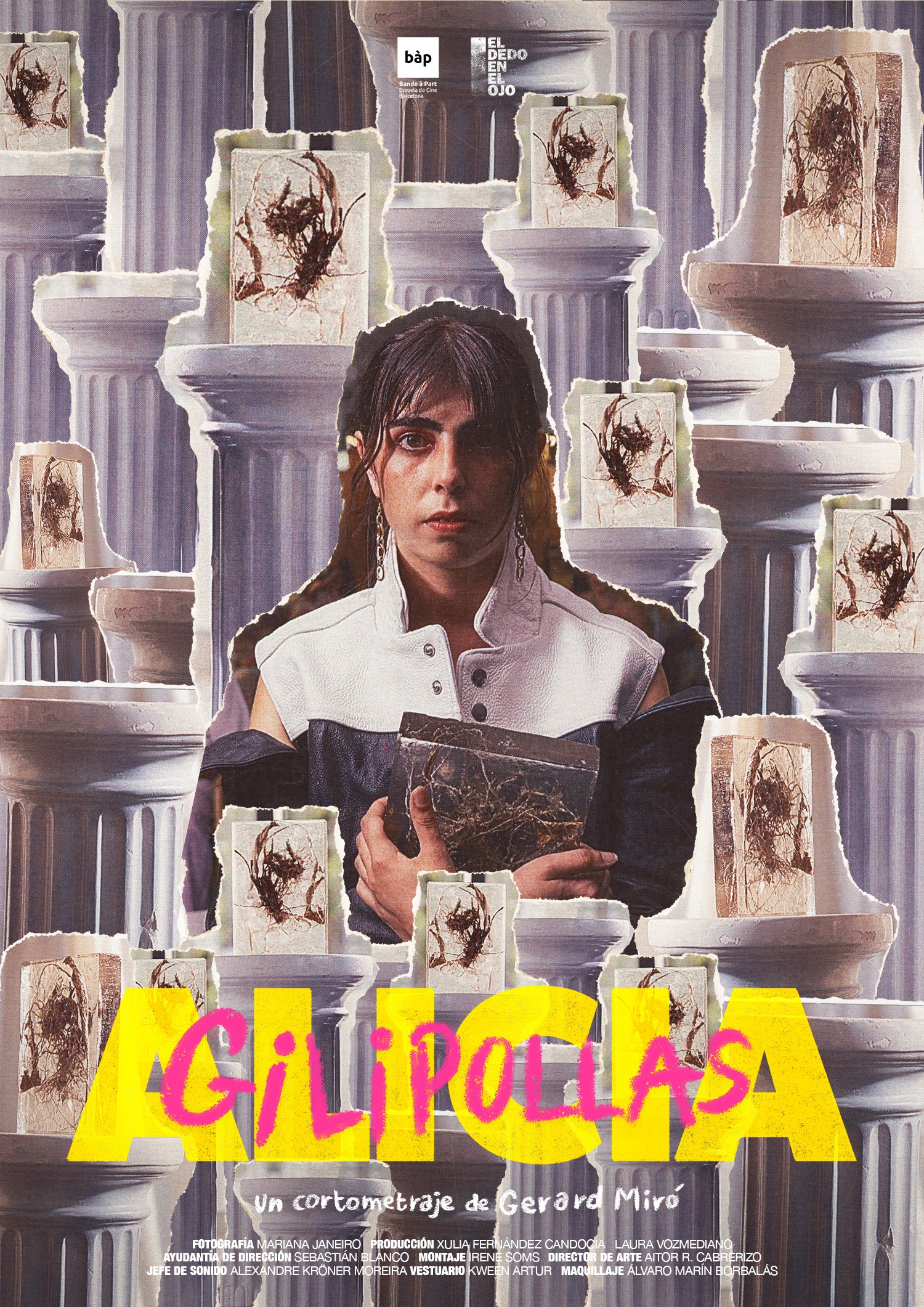
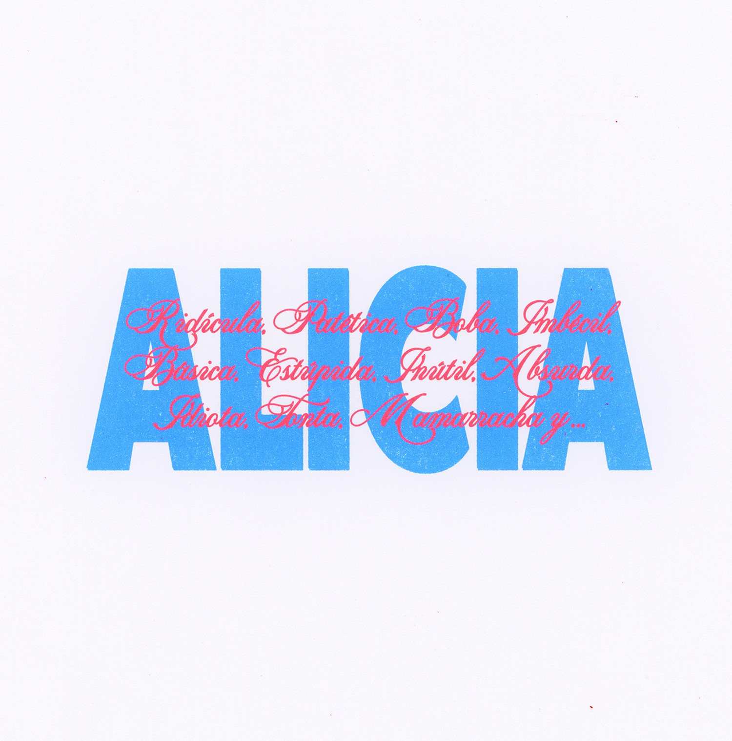
Paranoia, performance, and blonde wigs. Alicia’s breakdown becomes a collage of stitched selves and scribbled insults.
Paranoia, performance, and blonde wigs. Alicia’s breakdown becomes a collage of stitched selves and scribbled insults.
The Story
A group of nightclub workers, exploited and overlooked, decide to revolt. Their uprising blurs into a surreal dance of techno, rebellion, and rhizomes—growing, connecting, disrupting. Rizomas Salvajes is a story of collective resistance and the messy beauty of breaking free.
The Challenge
Having done the still photography myself during the shooting of Alicia Gilipollas, I was approached late in the postproduction by Gerard Miró and Bande à Part to do the visual identity for it. On a tight schedule and limited resources, we had to somehow build Alicia's complex world. The goal was to reflect Alicia’s mental fragmentation and performative persona through a visual identity that felt both chaotic and intimate, without flattening her experience into something polished or distant.
What We Created
Our starting point was the rhizome: a structure that grows unpredictably, connecting and spreading beneath the surface. We abstracted this into a graphic motif—organic yet fragmented—running through the promotional materials.
Portraits of the characters serve as the foundation of the visual identity, treated with an inverted color palette to evoke alienation and anonymity. A matte, black ink-like texture obscures masks and balaclavas, reinforcing themes of concealment and defiance.
To contrast this darkness, we introduced a vivid neon green—used for the rhizome motifs and the title wordmark—symbolizing disruption, movement, and the relentless spread of resistance. The primary typography is a bold sans serif, fractured by creeping rhizomes that nearly break it apart. For secondary text, we embraced a serif that bleeds, expands, and merges with other letters, forming a living network—echoing the film’s exploration of solidarity, fluid identities, and collective struggle.


Behind the Process
Creating the visual identity for Rizomas Salvajes meant first questioning how rhizomes should be represented. We studied hundreds of images of roots and underground networks, testing whether a literal depiction was necessary. As we refined the wordmark, we realized that embedding rhizomes directly into the typography felt forced—too expected. Instead, we embraced a more abstract approach, letting the rhizomes exist separately in the posters and graphic elements while allowing the typography to remain bold, raw, and untethered.
Connect to Content
Add layers or components to swipe between.
aleixstudio@gmail.com
(c) aleix serra 2026
Alicia Gilipollas
Paranoia, performance, and blonde wigs. Alicia’s breakdown becomes a collage of stitched selves and scribbled insults.
Paranoia, performance, and blonde wigs. Alicia’s breakdown becomes a collage of stitched selves and scribbled insults.
The Story
A group of nightclub workers, exploited and overlooked, decide to revolt. Their uprising blurs into a surreal dance of techno, rebellion, and rhizomes—growing, connecting, disrupting. Rizomas Salvajes is a story of collective resistance and the messy beauty of breaking free.
The Challenge
Having done the still photography myself during the shooting of Alicia Gilipollas, I was approached late in the postproduction by Gerard Miró and Bande à Part to do the visual identity for it. On a tight schedule and limited resources, we had to somehow build Alicia's complex world. The goal was to reflect Alicia’s mental fragmentation and performative persona through a visual identity that felt both chaotic and intimate, without flattening her experience into something polished or distant.
What We Created
Our starting point was the rhizome: a structure that grows unpredictably, connecting and spreading beneath the surface. We abstracted this into a graphic motif—organic yet fragmented—running through the promotional materials.
Portraits of the characters serve as the foundation of the visual identity, treated with an inverted color palette to evoke alienation and anonymity. A matte, black ink-like texture obscures masks and balaclavas, reinforcing themes of concealment and defiance.
To contrast this darkness, we introduced a vivid neon green—used for the rhizome motifs and the title wordmark—symbolizing disruption, movement, and the relentless spread of resistance. The primary typography is a bold sans serif, fractured by creeping rhizomes that nearly break it apart. For secondary text, we embraced a serif that bleeds, expands, and merges with other letters, forming a living network—echoing the film’s exploration of solidarity, fluid identities, and collective struggle.
Behind the Process
Creating the visual identity for Rizomas Salvajes meant first questioning how rhizomes should be represented. We studied hundreds of images of roots and underground networks, testing whether a literal depiction was necessary. As we refined the wordmark, we realized that embedding rhizomes directly into the typography felt forced—too expected. Instead, we embraced a more abstract approach, letting the rhizomes exist separately in the posters and graphic elements while allowing the typography to remain bold, raw, and untethered.
Connect to Content
Add layers or components to swipe between.
aleixstudio@gmail.com
(c) aleix serra 2026